
(an example of Frutiger Metro)
Frutiger Metro is a broad design aesthetic that encompasses the "Frutiger" vector-based graphic designs of the 2000s and a variety of other, loosely related and stylistically differing Frutiger Family styles utilizing glossy textures, abstract flourishes, humanism, nature, gradient blocks, and/or elements similar to Vectorbloom. Mainly, it combines flat, minimalist graphics with a maximalist design philosophy, typically catering to a pre-teen/teenage demographic. Frutiger Metro shares many similarities with Frutiger Aero and other aesthetics of the time; unlike Frutiger Aero, which focuses significantly on detailed glossy 3D designs, Frutiger Metro is flat.
With bold, simple shapes and colours like black and vibrant blues, greens and pinks, Frutiger Metro, features shiny textures, a human touch, natural elements, skeuomorphism, bokeh effects, and other bright, lively colors.
History, from Aesthetics Wiki
Prevalent from the mid-2000s (approximately 2004) until the early 2010s (around 2013), Frutiger Metro gained significant popularity alongside Frutiger Aero. Its influence extended into corporate design and internet culture, resulting in numerous variations and sub-aesthetics that highlight its extensive appeal.
The pinnacle of Frutiger Metro occurred in the late 2000s, a period during which the Frutiger Family of design aesthetics achieved significant cultural prominence. This era saw Frutiger Metro gain widespread acclaim, paralleling the success of Frutiger Aero, as it became prevalent across various aspects of popular culture, daily life, internet phenomena, media, and corporate branding.
The most significant application of Frutiger Metro occurred in Microsoft's Windows 8 operating system, which was launched in 2012. This iteration of Frutiger Metro featured a streamlined and less intricate version of the original aesthetic, subsequently referred to as Flat Metro. This period marked the decline of the 'Frutiger' era and the onset of new design philosophies, such as Flat Design, characterized by its two-dimensional appearance. By 2017, Flat Design had become fully established, alongside the Corporate Memphis style, indicating the waning popularity of both Frutiger Metro and the Frutiger Family in mainstream design.
Since 2022, Frutiger Metro has experienced a resurgence through recent social media, reminiscent of the Y2K Futurism revival. It is also plausible that a 'Neo-Metro/Aero' movement is currently emerging or will emerge in the future. This phenomenon exemplifies the '20-year nostalgia cycle,' as Frutiger Metro and Frutiger Aero have begun to evoke widespread nostalgia approximately 18 years after their initial introduction.
While there are artists that have expanded on the aesthetic, such as kelvindesign on DeviantArt, it is also prevelent in other media like tv shows, toys and other physical mediums.
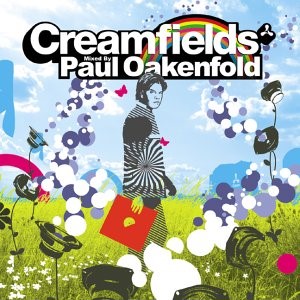
For example, the cover for the album Creamfields by Paul Oakenfold.
Fijit Friends (2011), the packaging for the toy has an easy yet fresh look with simple shapes with limited colours in a mandela formation, the products within said packaging have a degree of transparency that makes it look clean and glossy.
![Fijit Friends - Accessory Pack (2011) [Logan] Mattel - Girl Tech | eBay](https://i.ebayimg.com/images/g/tn8AAOSwuVtjXHBE/s-l400.jpg)
iDog (2005 - 2009) is another example of Frutiger Metro, while the product itself may not strictly represent the aesthetic despite its simple shaped form, the promotional image background does. Simple blue gradients in a wave formation with transparent musical notes dotted around the image.

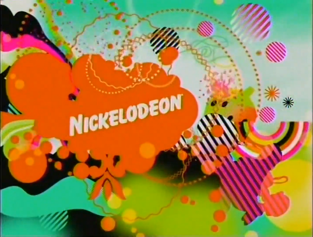
To maintain a childs attention span, the use of color enhances attention span by preventing a dull environment and facilitating mental engagement, which in turn boosts both attention and concentration. Factors such as eyestrain, contrast, glare, minimal distractions, levels of stimulation, and concentration are directly influenced by color, so with a mix of vibrant colours and Frutiger Metro, at the time in 2005, Nickolodeon created a bumper with both together.
kalvindesign focuses on the digital aspects of Frutiger Metro rather than the physical, using vivid themes of nature with simple colour gradients. With half tone around the edges to make the edges less sharp, using this effect makes the image feel aged as the half tones textures was more common in the 1980s. The simple use of circles in this image towards the bottom and the bokeh at the top feels like a transition from the usage in Frutiger Aero to Metro though time as Frutiger Metro was around at the same time.
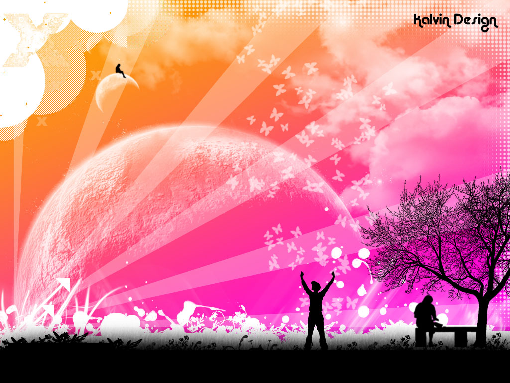
('wallpaper_2' kalvindesign, 2007)
So with a mix of flat design, bright colors, and use of abstract shapes and patterns with inspirations from other artists and images, I made my own;

('Metro 1 (A2)', Ella 2025)
Process images:


Inspired by the transition of Frutiger Aero to Metro with the Windows Xp background.

('Midway (A2)', Ella, 2025)
Process images:


Inspired by different Frutiger aspects made into Aero.

('self made Metro', Ella, 2025)
Process images:


Inspired by the vibrant and colourful images that seem to be bursting outward from the centre.

('Colourful Metro', Ella, 2025)
Process images:


Rather than presenting my work on something physical such as a canvas or on certain materials like acetate or paper, I would rather present mine in a simple, static fashion on a screen while they cycle through the images and animations, just like when the aesthetic was popular and how it itself is presented, as well as like the Arts Council Collection National Partners exhibition - As Seen On Screen.
Each of the final pieces were converted into a video of chronological order of which each piece was done. The original idea was to just show the images and have them on a slideshow, however I later thought of how still and boring it could become if it was a static image. But I as advised to keep it the opposite.
Each image had its timelapse stitched together to make one continuous video for me to loop on screen for its presentation for this years show. Despite feedback in group discussions there is no sound as originally planned as I found out that the softwear that I would use was a little too difficult for me to navigate and remember where some functions were located. I would not have enough time to play around and make something despite me making a simple melody based on stuff I listen to. However it still lets the viewers think of what it could have sounded like.
(screenshot of the images and timelapses stitched together)

Inspired by the aforementioned As Seen On Screen, I chose to keep my presentation simple and keep it on a screen with no human intervention unless necessary
As for viewing the final piece in absence of the show, it is on Youtube.


No comments:
Post a Comment