
(St. Mary's church that I had based my works from)
For me, my inspiration for this project was the St. Mary's church just down the road from the museum, as the structure and architecture of the churches had fascinated me of how they looked, thus I would be using the shapes from this building in my own pieces of work, making it the centre piece.
The person that had inspired me to work on building/shapes like this is Thomas Telford (1757 - 1834), who was Telford's most famous canal works include the 60-mile Caledonian Canal (1804-1822) and Ellesmere Canal. In the Highlands of Scotland, Telford was responsible or about 1,200 miles of new or improved roads. The architecture of these structures, even though it looks simple, has inspired me with my own, but yet it has many details and structures. Whereas my inspiration on the church also matches this, as its textures and patterns interest me.

I had also been inspired by a work that was already in the room that our exhibition would be set up in, it consisted a silhouette of small branches of a tree and a top of a hill in front of a sunset, where my first piece of work would be based from this.

But after finishing this piece I came to the conclusion that I would use this shape of the church for my works through out this part of the project, but if I was to re-make this piece, I would experiment with other type of materials, bigger or smaller sizes and colours of paint to get a different effect of the sky. But seeing as my previous project consisted of me using paints a lot, I considered using different materials. such as card and chalk.


I had used the acrylic paint's piece left over piece of card I had cut out to use as a stencil for this piece which I had used white chalk to create this over blue card. I had used blue card to give the feeling of looking up at the church to see the blue sky, yet this is a different technique to all of my previous works, as I hadn't used chalk in my art works.

After creating this chalk piece, I created another just like this, only with a different coloured piece of paper. I decided to replicate the acrylic piece but with different materials.


(The Lino base)


Whilst making these Lino pieces, there have been two other pieces that I have further worked on or had second thoughts, to make the one I am Okay with stand out more, I have used a black acrylic paint pen to further enhance the bold lines. Because seeing as I had printed the white ink onto a lighter coloured piece of card, I didn’t think that it would look too light, so it would blend into the paper, so I used the pen to go over it so that it also looked layered and textured.

However, if I was to work on the other piece again, I would experiment on the colour matching first because I soon found out that the pink card did not work with the orange that I had mixed, I would have chosen a darker piece of card or make the orange lighter or darker so that it is easier on the eye.

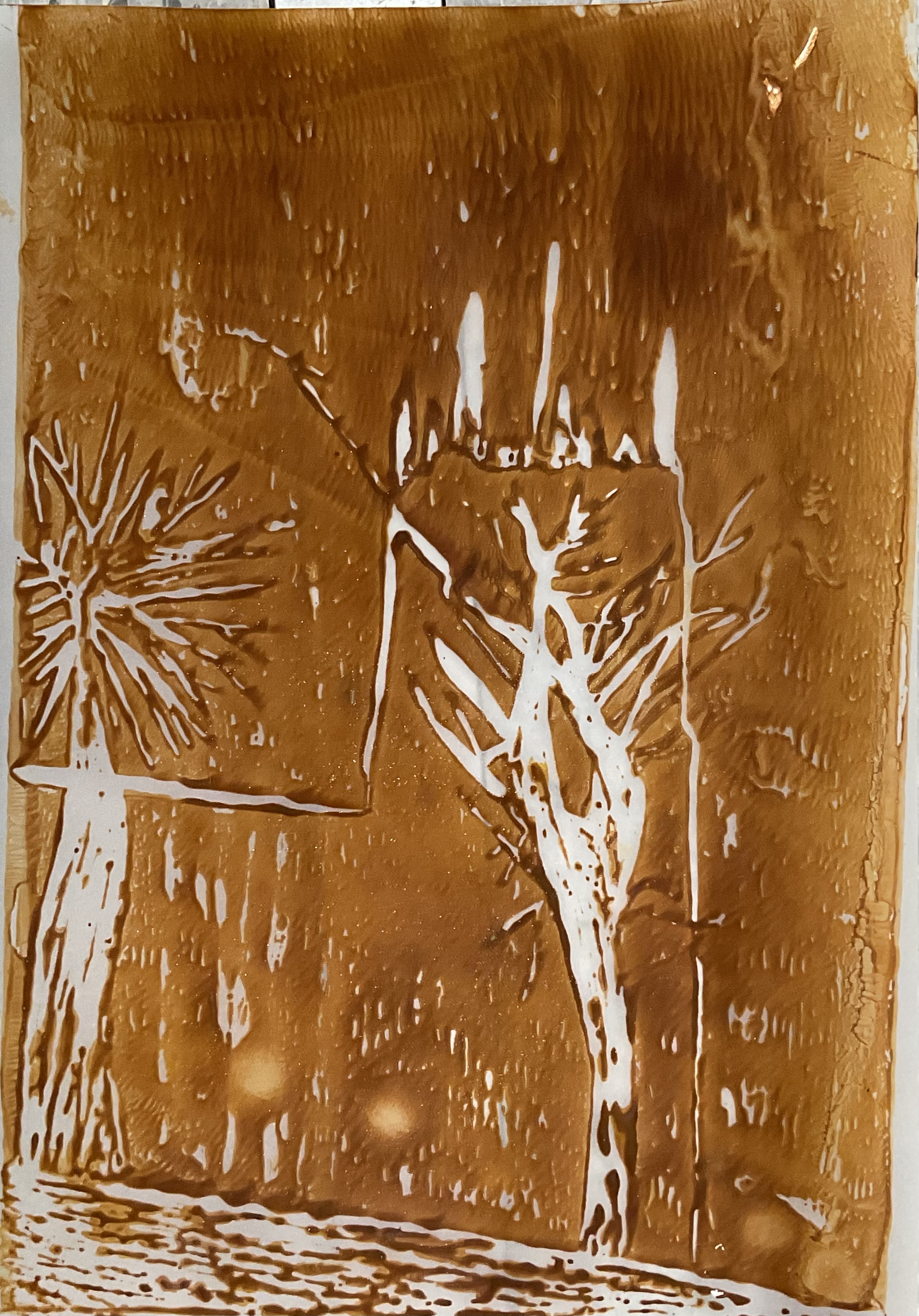
But while working on these, I decided to try out two colours of ink on one piece, I tried purple and yellow, thinking that it would create a marble effect with the colours, but as I was rolling the ink on the piece of plexiglass they both mixed, thus creating a brown/bronze colour, and knowing that I had to scale my works bigger, I decided to use a piece of A3 black card for this. And looking at it from a distance gives it a window effect.

Experimenting with the ink for the Lino, I used the stencil of the church for the outline and then used a paint roller to roll the ink over the top of the stencil to create the white silhouette on the background, but the ink didn’t manage to get to certain areas at the top of the church as they were smaller and more defined.

Staying with this size of material, I used other materials such as chalk, pencil, watercolour and acrylic pens to create different textures, looks and styles. In some of the pieces, such as these;


For this piece with the bright colours, I tried using them to make the outlines standout, as well as hope that it gives the image of the church a retrospective feel and look.
The chalk at the top of the image and around the silhouette of the church represents light and how people believe in God and see the church as a holy place to go and pray. These two works are still based from the silhouetted image referenced towards the start.
Using pencil, I tried to recreate my silhouette of the church in front of a sunset piece but in black and white, using the array of pencil shades and widths. And I believe that the use of the pencil gives it a more traditional effect as pencil is an easy material to get ahold of and use.

Throughout creating all of these works, on the side of these, I had been creating a ceramic version of the silhouette of the church out of clay before is is blazed for the first time so that it doesn't break, then glazed. I chose a grey-ish colour so that it would still keep the colour of the church itself. I wanted to keep some textures on it, so I used point objects to make lines all across the ceramic so that it isn't just a flat shape. But if I was to do this work again and make it better than this first attempt, I would experiment with the colours first so that I know how it could potentially work out, and I would also mould it bigger so that I can get more details in and, potentially, engrave the markings and windows of the original image of the church so that it would look like the actual church, but just down-sized in scale.
And upon first feeling when picking the final product up after being fired the second time in the kiln, it had a rough feeling from the clay, yet smooth from the coloured finish. It reminds me of the stone textures from the actual church itself, it is as if a part of the structure has been cut out, reshaped and recoloured.


No comments:
Post a Comment