Squiggly frantic lines can represent feelings of uneasiness, such as the colour red can indicate an overwhelming sense of anger, or black can symbolise death and mystery among the viewers, as well as white symbolising life and purity. Blue can represent sadness whereas yellow represents happiness. There is an effect on some viewers and how they see colour as about 4% of the population could potentially have the rare sensory trait called synesthesia, where people "see" or associate letters and numbers with specific colours. The most common form of this is called grapheme-colour synesthesia.
At the start of this project, I experimented with how emotion and colour can determine how a piece of art is made, solely thinking of how the colours can portray emotions. In the psychology of art, the relationship between art and emotion has newly been the subject of extensive study thanks to the intervention of esteemed art historian Alexander Nemerov.
.jpg)
Inspiration for these works has come from Edvard Munch with his best know work, The Scream, created in 1893. Impressionism inspired Munch from a young age, and in 1881, he enrolled at the Royal School of Art and Design of Kristiania, one of whose founders was his distant relative Jacob Munch. His teachers were Julius Middelthun, a sculptor, and naturalistic painter Christian Krohg. Munch demonstrated the quick absorption of his figure training at the academy in his first portraits, including one of his father and his first self-portrait. In 1883, Munch took part in his first public exhibition and shared a studio with other students.
Munch used the ideas of the French Impressionists, painting the streets of Paris and his hometown of Oslo (then Kristiania). In Berlin he discovered the possibilities of printmaking, teaching himself various techniques, such as woodcut, lithography and etching.
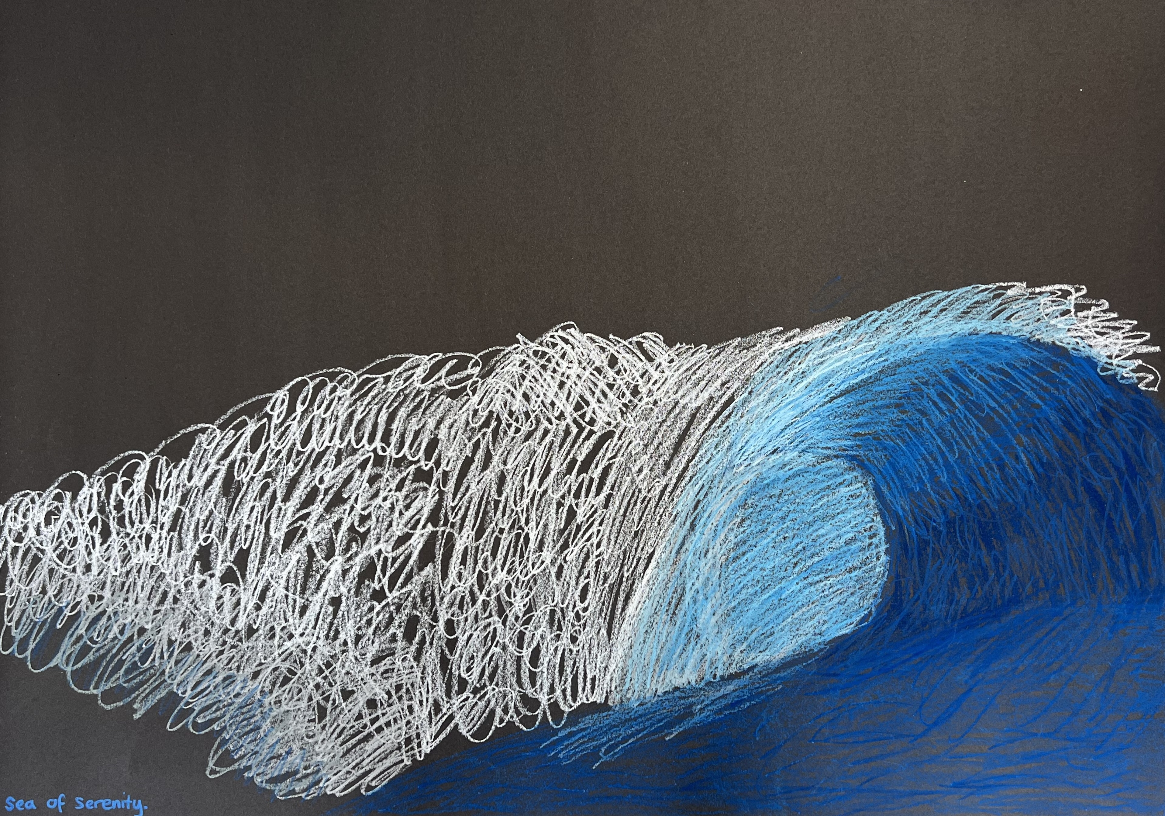
The swirling lines in The Scream create a sense of movement, much like Vincent Van Gogh did in The Starry Night. Swirling lines were used for the surrounding nature and also the distorted figure.


(Starry Night by Vincent Van Gogh)
To spark some ideas for my own works, I researched art in emotion and made a non-exact copy of the image inspired by a student's example. With my version of this image, I kept the same shapes and colours, the only difference is the shades of colours, I also replicated it onto canvas, but if I was to do this again, I would do it again with different materials. The simplicity of this image still conveys the contrasting emotion of sadness or happiness, the face of this figure is yellow, which represents happiness or hope, whereas the red eyes can represent the anger of the artist or the emotion they are trying to convey.


However, whilst creating these, I came to the conclusion that creating pieces this way did not convey feeling or meaning some time later, even if I did feel such emotions whilst in its creation. I tried to copy some techniques from Munch, such as the loose lines yet curvy, yet it didn't fully work, so I attempted the same techniques on something else.


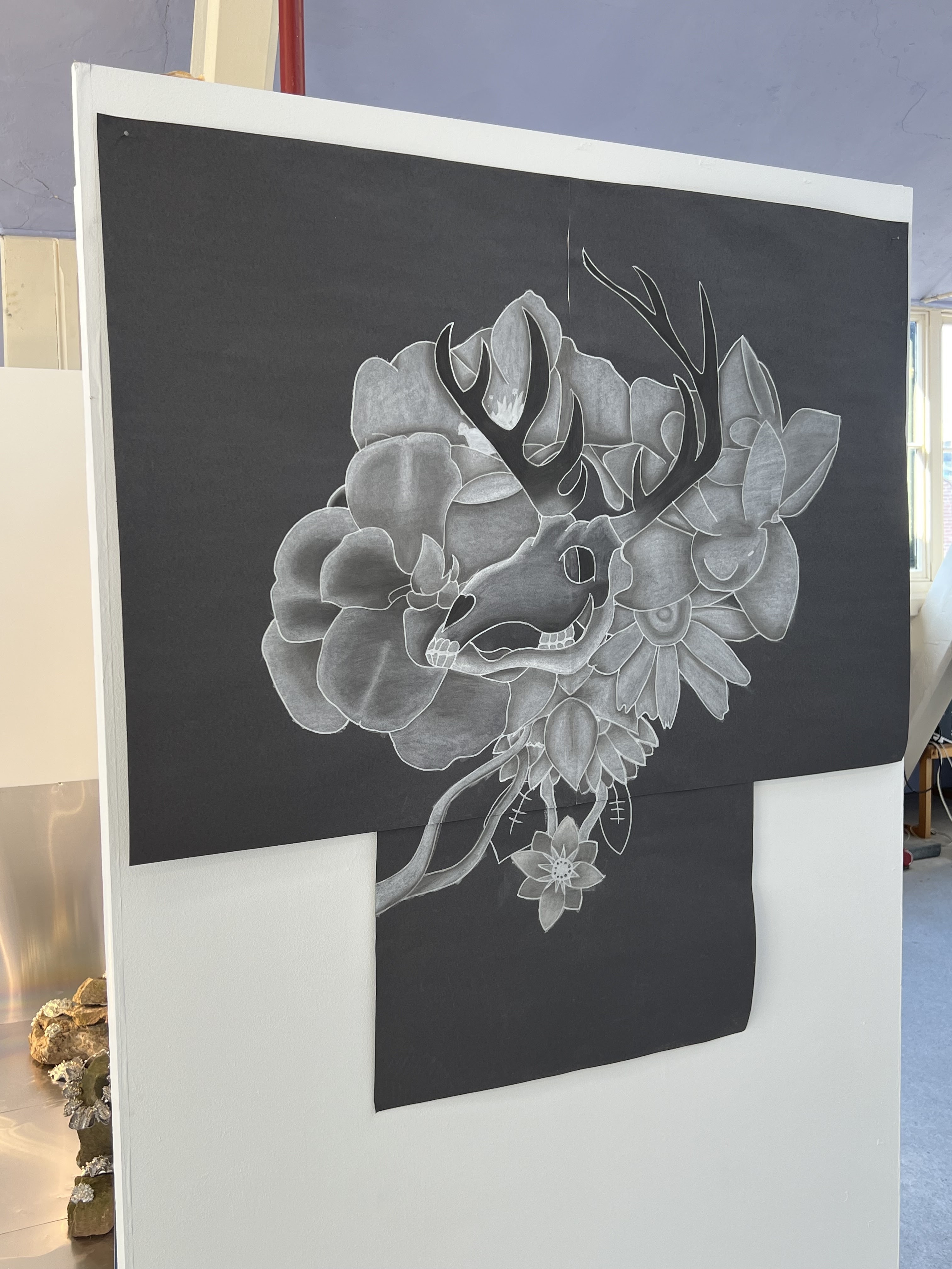
So I took inspiration from the last project, Time, and made it into a physical thing; a clock. So I painted it calming yet eye-catching. White represents purity, green means new beginnings and yellow meaning positivity, all of this on the clock with the time stamp of something important: a birth. Time is also represented by skulls and flowers, life and death, thus showing the passing of time.
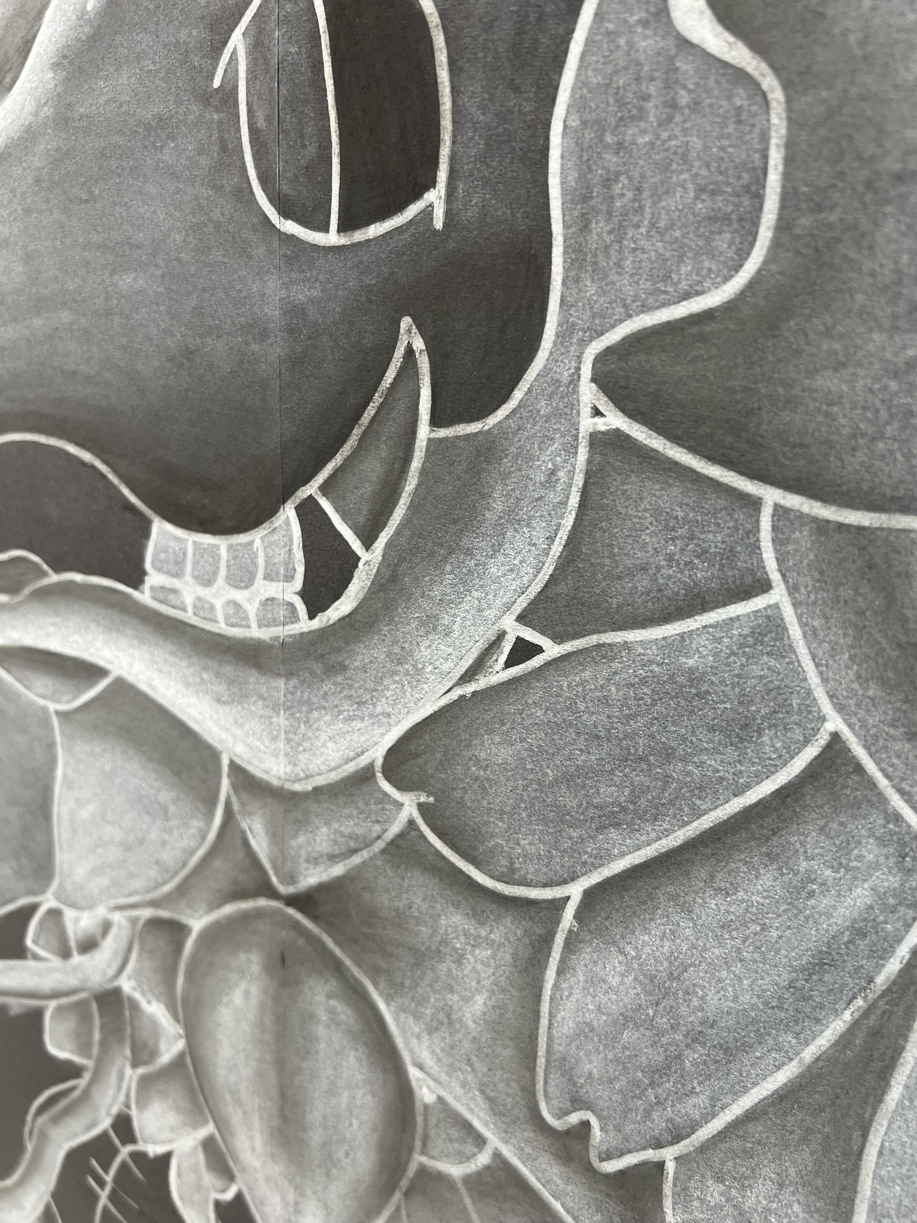
A skull purely represents the loss of life with pure death, and I decided to combine them together thus making a floral-like grave with flowers growing around them. The darkness of the charcoal pencils can emphasise the feeling and make the skull stand out to the viewer, as it is already the centre of the image and gives more depth, as well as how the skull was centred and flowers were put around it so that it doesn't cover the whole image, thus the viewers' vision is centred on one thing.


No comments:
Post a Comment