Monday, 20 February 2023

Module pieces - Time

Time in the art can be implied or can be actual time. Actual time includes time-based work and media, artwork that changes through time, and the effect of time on painting and how that affects its meaning. Implied time can be represented in the captured moment, evidence of time already passed, or an illusion of passing time. Recent technological developments have created many different forms of artistic possibilities such as video game art or visual art.

As well as time, art exists in space. Time implies change and movement; movement implies the passage of time. Movement and time, whether actual or an illusion, are crucial elements in art although we may not be aware of it. Artwork may incorporate actual motion; that is, the artwork itself moves in some way. Or it may incorporate the illusion of or implied movement. Contemporary artworks that include video, film, audio or computer technologies are referred to as time-based media works because they have duration as a dimension and unfold to the viewer over time. Movement is the path the viewer's eye takes through the work of art, often to focal areas. Such movement can be directed along lines, edges, shapes, and colours within the work of art. Artists use movement to control the viewer's eye through a work of art.

There are three (3) types of movement in art:

- Physical movement - This can be conveyed by drawing or painting lines from the moving object.

- Juxtaposition - The artist portrays the subject somewhat in a "freeze frame.” This type of movement can show the subject in the air, or at an angle.

- Moving the viewer's eye - Movement is dictated by how the objects are placed on the picture plane or by how the artist uses the elements of art throughout the artwork. Hokusai's Under the Wave off Kanagawa is an example of how an artist can move the viewer's eye.


(Hokusai's Under the Wave off Kanagawa)

Circular time shows a cycle or repeating pattern such as an analogue clock and a labyrinth. Motion in the art can be where the craft actually moves in a kinetic way or when art shows that an object is moving. Movement in art is expressed with blurry images, placement of things, and different use of lines.


A contemporary artist that worked with the concept of time is Felix Gonzalez-Torres, born in Guáimaro, Cuba. He lived and worked in New York City between 1979 and 1995. Gonzalez-Torres died in Miami on January 6, 1996, from AIDS-related causes. The University of Puerto Rico is where he began his art studies before moving to New York City, where he attended the Whitney Independent Study Program, first in 1981 and again in 1983. He received his BFA from Pratt Institute, New York, in 1983 and then in 1987, his MFA from the International Center of Photography and New York University.

All of Gonzalez-Torres' works, with some exceptions, are titled "Untitled" in quotation marks, sometimes followed by an interposed title. This was a titling scheme by the artist as "Untitled" was dedicated to Gonzalez-Torres's deceased lover, Ross Laycock, who died of an AIDS-related illness in 1991. Here are the guidelines the artist supplied to MoMA when the museum set to display his clock-related work:

“When installed, the two clocks were to touch; the clocks could be replaced with white plastic commercial clocks of similar dimensions and design; the minute and second hands were to be set in sync, with the understanding that eventually they might go out of sync during the exhibition; if one of the clocks needed the batteries replaced, it was to be done, and the clocks were to be reset accordingly; the clocks were to be displayed on a wall painted light blue.”


("Untitled" (Perfect Lovers))

I have used Torres' works as inspiration because each piece of art of his shows a very specific moment in time, even including time and death, and I have worked with this notion and created some of my own pieces of art that show moments in time, even in the present. Another artist that inspires me for this is Russell Young.
Young is a British-American artist best known for large silkscreen paintings using imagery drawn from recent history and popular culture. Young's artistic methods include painting, screen printing, sculpture, installations and film, such as diamond dust on a certain material, just like how I have used similar materials and methods throughout this project.
Just like how Torres has shown a certain moment in time in this piece of art, I have been inspired to show this too but with a different media; digitally, with a timelapse of just under an hour some quiet background noise to make it seem less isolating if one was to watch with volume. 


A moment of time piece of art by Young that I like most is called Marylin In Korea (Black and White), created in 2011 with Black and Gold with Diamond Dust and Unique Silkscreen which is worth £10,000 - 20,000. Based on Marylin's visit to Korea in February 1954 where Marilyn Monroe and Joe DiMaggio were newlyweds, on a trip to Japan when the bride took a detour to Korea to entertain the troops. She performed ten shows in four days, in front of audiences that totalled more than 100,000 soldiers and marines.


(Marylin In Korea (Black and White))


(Dalí in 1939)


A non-contemporary artist that worked with the concept of time is Salvador Dalí, 1904 - 1989. Influenced by Impressionism and the Renaissance masters from a young age he became increasingly attracted to Cubism and avant-garde movements. He moved closer to Surrealism in the late 1920s and joined the Surrealist group in 1929, soon becoming one of its leading exponents. His best-known work is The Persistence of Memory which was completed in August of 1931 and is one of the most famous Surrealist paintings. It currently resides at the Museum of Modern Art in New York City.

Dalí's artistic repertoire included painting, graphic arts, film, sculpture, design and photography, at times in collaboration with other artists. He also wrote fiction, poetry, autobiography, essays and criticism. Major themes in his work include dreams, the subconscious, sexuality, religion, science and his closest personal relationships.

For this project, I have centred my pieces around the concept of time, such as The Persistence of Memory, becoming heavily inspired. For example, I can replicate the golden pocket watch on the left that has melted down the side of the surface it is sitting on. I have decided to not let this piece of work be an exact replica of the original image because this could represent the fact that it looks like I ran out of time whilst making this. In contrast, the original image had a lot of time working with this to make as detailed and realistic as possible.

The orange clock at the bottom left of the painting is covered in ants. In many regions, ants represent willpower, patience, cooperation, and power, but Dalí often used ants in his paintings as a symbol of decay, which happens to old, dead or rotting things over some time. Another insect in the painting is a fly, which sits on the watch next to the orange watch. The fly appears to cast a human shadow as the sun hits it. The Persistence of Memory uses realist painting techniques to depict imagery more likely to be found in dreams than in waking consciousness. I could add these smaller details and potentially make the clock look worn down or disfigured on purpose, so it shows the process of time and what can happen during the period.

A consistent shape in this image is a circle or spherical shape, albeit looking second or third-dimensional. If one was to touch this piece of work, one would realise that most of it would have a rough texture, even if it looks smooth. From the top to the bottom of the image, we see a pattern of brighter colours at the top. In contrast, the darker ones are at the bottom, the darker colours at the bottom can represent the decay process again, whereas the brighter colours towards the top can represent the goodness in life.


I have made my own copy of this image, but if I was to recreate this again because I do not like this work very much, I would do it on a different material, as the current material is a type of card that has a slick feeling, but instead, I would recreate it on a canvas instead. And just like my initial idea and my inspiration, I decided to not finish it to make it just like the original, yet let it look unfinished, again showing that a lot of time is needed to recreate it with as much detail as possible.


During this project, I continued to experiment with different types of media, such as painting, lino prints and real objects, using different kinds of papers and cards to give each creation a different texture and feel. But I have also decided to focus on moments in time, such as people doing something or something symbolic of something that has happened in the past, such as a death or birthday.

The first thing I made in this project to help conjure up some ideas, is what represents time; life, death and types of clocks, like an hourglass. An hourglass is an idea I have used throughout. But whilst working on the lino prints, I had not realised that the image would print backwards on the final product. But I eventually concluded that it could work well as only some things to do with time look correct, such as facing forward. Sometimes it can face backwards and not look stereotypically average. So on one of these prints, I have written the words facing the way they should be, this can represent the duality of time and how it can be shown no matter where in time it is set. But with the colour scheme, I decided to experiment with colours to see what colour goes well with what. But I decided to stick with black and white because the two colours can be a stereotypical representation.

On the stencil of the Lino print, I have included the sun and moon. The sun represents life but it's also known to typify energy, power, positivity, and clarity. The sun is a natural force that's outside our control, but it also illuminates the world around us, helps living creatures navigate the planet, and sustains many essential ecosystems. The sun signifies time and life, but the sun being at the bottom of the image, shows that the day is beginning or ending, and time is passing. This is also shown by the moon at the top of the image, and the moon universally represents the rhythm of time as it embodies the cycle. The phases of the moon symbolize immortality and eternity, enlightenment or the dark side of nature itself as well as completion, fertility, abundance, and transformation, which, again, all takes time.


Involving the concept of time, life and death in this project, I researched things that have to do with the concepts. Such as flowers that represent life and death, like lilies, chrysanthemums and roses, daffodils and pansies. As well as a skull, that purely represents the loss of life with pure death, and I decided to combine them together thus making a floral-like grave with flowers growing around them. Whilst making this artwork, I realised that the moon in the corner does not work, so when I made a second attempt, I replicated the skull but with different flowers and their positioning and made the image bigger, not including the moon.
I added shading onto all the areas to make each part look more authentic, and realistic with depth.


While conjuring ideas for this project, I used quotations about time on some paper before making it look old, dishevelled and aged. But the structure of these pieces of paper reminds me of Dalí's The Persistence of Memory, because of how the original painting has melted clocks, and these pieces of paper look melted and broken down just like the clocks. These quotations have the theme of making the viewer think about these words and make them think about what else they could mean. To make the words bold and stand out to the viewer I used a black acrylic paint pen and graphite pencils to make the paper look old. And the look of these pieces of paper reminds me of the first photograph taken by Joseph Nicéphore Niépce.


(Image taken by Joseph Nicéphore Niépce titled View from the Window at Le Gras)


["lost time is never found again" - Benjamin Franklin]


["if not now, when? never"]

Branching off ideas taken from each photographer, and staying with my own vision of old and new, thus showing what the time between each photograph can show how things have naturally progressed through the years, I have decided to show the contrasts between objects that are shown to be more modern.
For example, a collection of CDs can contrast with an array of cassette tapes, as both can show how time has progressed and how things have changed.
If an audience was to look at these images of an old cassette collection, some of the younger audience may gather a sense of anemoia, defined as nostalgia for a time you've never known, whereas an older audience would be familiar with these, as they may have experienced using these in their lifetime, the use of the old carpet and wooden background can only help amplify the feeling. This can potentially give off an 80s vibe, where everything has changed since then,  as cassette tapes were most popular in the 1980s.
However, the older audience may not be so familiar with a collection of CDs, whereas the younger viewers would have more experience with them as they had grown up listening/working with them.


Children's toys in the 21st century consist of popular franchises and electricity, to create more active objects, whereas in the early-mid-1900s, after World War II there was an increase in the popularity of clockwork tin toys, as children in the 40s would see these military vehicles and then have them as a toy sooner or later.
The world was still recovering from World War II, and most parents could tell their children what it was like. It was the subject of many popular films of the period and the cause of most of the world’s political problems at that point in history. Some children would continue to gather these toy tanks and over time, thus starting a collection, making the children's room full of these toys. All of these objects are candid (not posed in a certain way), which can resemble the first photograph taken by Niépce, as that image is candid.


This shows with other kids' toys too, such as trains, cars and other vehicles.


Alongside the contrasting ages and designs of toys from the mid-1900s and recent years, I also decided to look at how technology has changed over the years, as televisions developed into colour, phones were designed as smaller and able to do much more, as well as computers as they had gotten smaller from needing an air-conditioned room to the laptops we have today. I used photos of a computer and phone, old and new, on acetate for transparency so the light can come through and show the contrasting image, showed with simple white outlines.


Thursday, 19 January 2023

Research - Site specificity

The term site-specific refers to a work of art that has been tailored specifically for a particular location and that has an interrelationship with the location, and said works are not always permanent. They are temporary as well as not damaging to the environment. Site-specific art is produced by commercial artists, and independently, and can include some instances of work such as sculpture, stencil, graffiti and other art forms. Installations can be in urban or remote natural settings, and potentially underwater.

As a site-specific work of art is designed for a specific location, but if it is removed from that location it will lose all or a substantial part of its meaning. The term site-specific is often used in relation to installation art, as in site-specific installation; and land art is site-specific almost by definition.

The term "site-specific art" was promoted and refined by Californian artist Robert Irwin. Still, it was first used in the mid-1970s by younger sculptors, such as Dennis Oppenheim, who had started working on public commissions for large urban sites. Modernist art objects were transportable, nomadic, could only exist in the museum space and were the objects of the market and commodification. Since 1960 the artists were trying to find a way out of this situation and thus drew attention to the site and the context around this site.


Dennis Oppenheimer (1938 - 2011) was an American conceptual artist, performance artist, earth artist, sculptor and photographer. His early artistic practice is a questioning about the nature of art, the making of art and the definition of art: a meta-art that arose when strategies of the Minimalists were expanded to focus on site and context. This work, for example, is tailored for this area as this area is big enough for the circles to branch out and it would not go well in places without snow.

This image is called 'Annual Rings,' taken by Oppenheimer in 1968. This a prototype of his land work, consisting of shovelled pathways the snow, on either side of a frozen waterway dividing the United States and Canada and their own time zones. The feeling of this image, to me, feels liminal. Because of how simple the way this piece of work is made, as well as that it doesn't look like it belongs to someone on Earth. A small aperture was used to capture the basic details, to the point we know how deep the snow is, and a low sensitivity level was used to keep the image bright so that we can continue to see the details like this. There is a circular pattern throughout this piece of work, and a circle is a universal symbol with extensive meaning. It represents the notions of totality, wholeness, original perfection, the Self, the infinite, eternity and timelessness. Even though this cannot be touched as it would potentially ruin it, but by the looking of it, the image looks soft and smooth, despite the snow being cold and crunchy, not smooth at times. And the continued use of white can work with the circles' symbolism, as the colour white can mean purity and goodness. I like this image because of how candid (not posed) this image looks even if the camera angle is positioned on purpose.


Another artist that works with the environment in a harmless way is Andy Goldsworthy (born 26Th July 1956). From the age of 13, he worked on farms as a labourer. He has likened the repetitive quality of farm tasks to the routine of making sculpture: "A lot of my work is like picking potatoes; you have to get into the rhythm of it." - The Guardian.
The materials used in Goldsworthy's art often include brightly coloured flowers, icicles, leaves, mud, pinecones, snow, stone, twigs, and thorns. He has been quoted as saying, "I think it's incredibly brave to be working with flowers and leaves and petals. But I have to: I can't edit the materials I work with. My remit is to work with nature as a whole." - The Daily Telegraph.

This artwork was completed in 2013 somewhere in the woods of England's Hampshire County, and is a part of Goldsworthy's book, 'Ephemeral Works.' The use of the golden to darker brown colours in this image help carry out the feeling of etherealness, magic, and warmth, as it is not normal to see a tree with such an appearance. Goldsworthy has used a medium sensitivity, small aperture and fast shutter speed to capture the detail and glowing effect from the leaf positioning. The main colours of these images are all dark, like black, brown and grey, which contrasts with the lighter shades and lighting positioning.
If one was to touch this, they would feel a rough feeling from the leaves and bark on the tree, despite the softness coming from the looks of it up-close and from afar. The use of low light sensitivity helps this. I would say that this photograph is very successful with the way it looks and conveys opinions on it, and the posed position of the camera shows the viewer just how much work has gone into this to look the way it is. This photograph is good in terms of site specificity because there has not been any major disruption to the foundations of the ground, and I like this image just because the positioning of the leaves in the area surrounding the tree makes this effective. So that this is environmentally good with no excess pollution being created in the process that would potentially harm the surrounding environment.


Thursday, 12 January 2023

Module pieces - Structure

While following up to our visit to the Erewash Museum, we began to create our own works for an exhibition that will be taking place there with inspiration from the architecture in the area of Ilkeston that the museum is in. 

(St. Mary's church that I had based my works from)

For me, my inspiration for this project was the St. Mary's church just down the road from the museum, as the structure and architecture of the churches had fascinated me of how they looked, thus I would be using the shapes from this building in my own pieces of work, making it the centre piece.

The person that had inspired me to work on building/shapes like this is Thomas Telford (1757 - 1834), who was Telford's most famous canal works include the 60-mile Caledonian Canal (1804-1822) and Ellesmere Canal. In the Highlands of Scotland, Telford was responsible or about 1,200 miles of new or improved roads. The architecture of these structures, even though it looks simple, has inspired me with my own, but yet it has many details and structures. Whereas my inspiration on the church also matches this, as its textures and patterns interest me.


I had also been inspired by a work that was already in the room that our exhibition would be set up in, it consisted a silhouette of small branches of a tree and a top of a hill in front of a sunset, where my first piece of work would be based from this.


But after finishing this piece I came to the conclusion that I would use this shape of the church for my works through out this part of the project, but if I was to re-make this piece, I would experiment with other type of materials, bigger or smaller sizes and colours of paint to get a different effect of the sky. But seeing as my previous project consisted of me using paints a lot, I considered using different materials. such as card and chalk.


I had used the acrylic paint's piece left over piece of card I had cut out to use as a stencil for this piece which I had used white chalk to create this over blue card. I had used blue card to give the feeling of looking up at the church to see the blue sky, yet this is a different technique to all of my previous works, as I hadn't used chalk in my art works.


After creating this chalk piece, I created another just like this, only with a different coloured piece of paper. I decided to replicate the acrylic piece but with different materials.


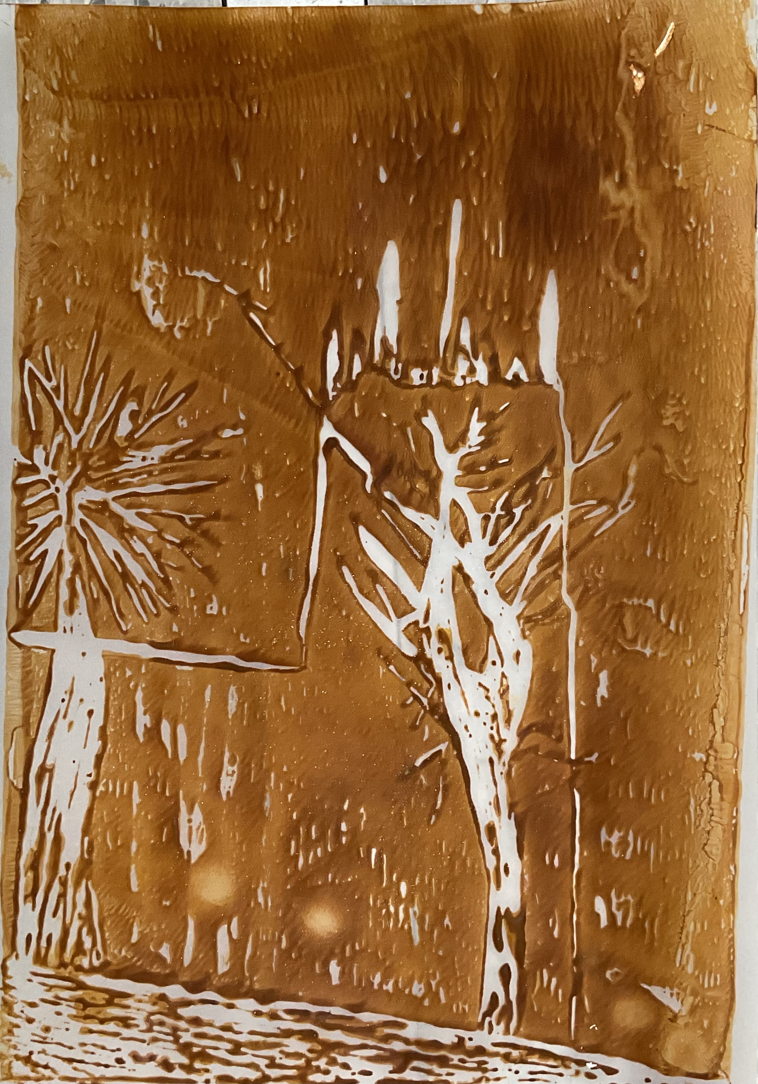
Throughout this project, I am progressing the amount is being put into my work. Such as the acrylic piece is a basic shaped piece, where as my Lino piece, I would be adding more parts from the image that I am basing this from, such as trees. I would be printing this image onto different coloured materials, such as card and tracing paper, with different coloured inks so that this will vary different technique I had done before. I have created more than a few so that I can easily determine which is better and how I could improve those that have not worked up to what I thought.

(The Lino base)


Whilst making these Lino pieces, there have been two other pieces that I have further worked on or had second thoughts, to make the one I am Okay with stand out more, I have used a black acrylic paint pen to further enhance the bold lines. Because seeing as I had printed the white ink onto a lighter coloured piece of card, I didn’t think that it would look too light, so it would blend into the paper, so I used the pen to go over it so that it also looked layered and textured.


However, if I was to work on the other piece again, I would experiment on the colour matching first because I soon found out that the pink card did not work with the orange that I had mixed, I would have chosen a darker piece of card or make the orange lighter or darker so that it is easier on the eye.


But while working on these, I decided to try out two colours of ink on one piece, I tried purple and yellow, thinking that it would create a marble effect with the colours, but as I was rolling the ink on the piece of plexiglass they both mixed, thus creating a brown/bronze colour, and knowing that I had to scale my works bigger, I decided to use a piece of A3 black card for this. And looking at it from a distance gives it a window effect.


Experimenting with the ink for the Lino, I used the stencil of the church for the outline and then used a paint roller to roll the ink over the top of the stencil to create the white silhouette on the background, but the ink didn’t manage to get to certain areas at the top of the church as they were smaller and more defined.


Staying with this size of material, I used other materials such as chalk, pencil, watercolour and acrylic pens to create different textures, looks and styles. In some of the pieces, such as these;


For this piece with the bright colours, I tried using them to make the outlines standout, as well as hope that it gives the image of the church a retrospective feel and look.

The chalk at the top of the image and around the silhouette of the church represents light and how people believe in God and see the church as a holy place to go and pray. These two works are still based from the silhouetted image referenced towards the start.
Using pencil, I tried to recreate my silhouette of the church in front of a sunset piece but in black and white, using the array of pencil shades and widths. And I believe that the use of the pencil gives it a more traditional effect as pencil is an easy material to get ahold of and use.


Throughout creating all of these works, on the side of these, I had been creating a ceramic version of the silhouette of the church out of clay before is is blazed for the first time so that it doesn't break, then glazed. I chose a grey-ish colour so that it would still keep the colour of the church itself. I wanted to keep some textures on it, so I used point objects to make lines all across the ceramic so that it isn't just a flat shape. But if I was to do this work again and make it better than this first attempt, I would experiment with the colours first so that I know how it could potentially work out, and I would also mould it bigger so that I can get more details in and, potentially, engrave the markings and windows of the original image of the church so that it would look like the actual church, but just down-sized in scale.
And upon first feeling when picking the final product up after being fired the second time in the kiln, it had a rough feeling from the clay, yet smooth from the coloured finish. It reminds me of the stone textures from the actual church itself, it is as if a part of the structure has been cut out, reshaped and recoloured.


Wednesday, 14 December 2022

Lakeside Arts

Nottingham Lakeside Arts is The University of Nottingham's unique public arts centre and museum presenting an eclectic programme of music, dance, theatre, visual art, special collections and family events all year round. Nottingham Lakeside Arts was established by The University of Nottingham in September 2001, when the Pavilion housing the newly built Djanogly Theatre first opened, adding to the University’s pre-existing arts buildings of the Djanogly Gallery and Djanogly Recital Hall.

(view of the main entrance of Lakeside Arts)

And so on the 14th of December, we travelled to the Lakeside Arts in Nottingham to take a look at the art works in the exhibition and to gather some inspiration for our own works that we will be creating in the future. To get to the exhibition, we arrived by tram to then walk through the grounds to the exhibition, where inside there were sculptures, drawings and prints created by Sophie Ryder.

She is renowned for her large-scale open-air sculptures of animals and mystical hybrid creatures. In the early 1990s, her reputation was established with monumental outdoor works constructed from twisted wire. Like her friend and supporter, the sculptor Elisabeth Frink, she has also worked in plaster and bronze as well as a plethora of other media including sheet metal and marble.


This exhibition focuses on the artist's smaller-scale sculptures shown alongside works on paper. Some of the bronzes are maquettes: models for much larger pieces. Others were created to be art works in their own right. Drawings and prints may relate directly to sculptures or vice versa or be entirely independent creations. Occupying a middle ground between the two are the wire drawings in which the artist has manipulated a mesh of twisted wire to construct flattened images on the wall. From a distance they resemble large charcoal drawings.


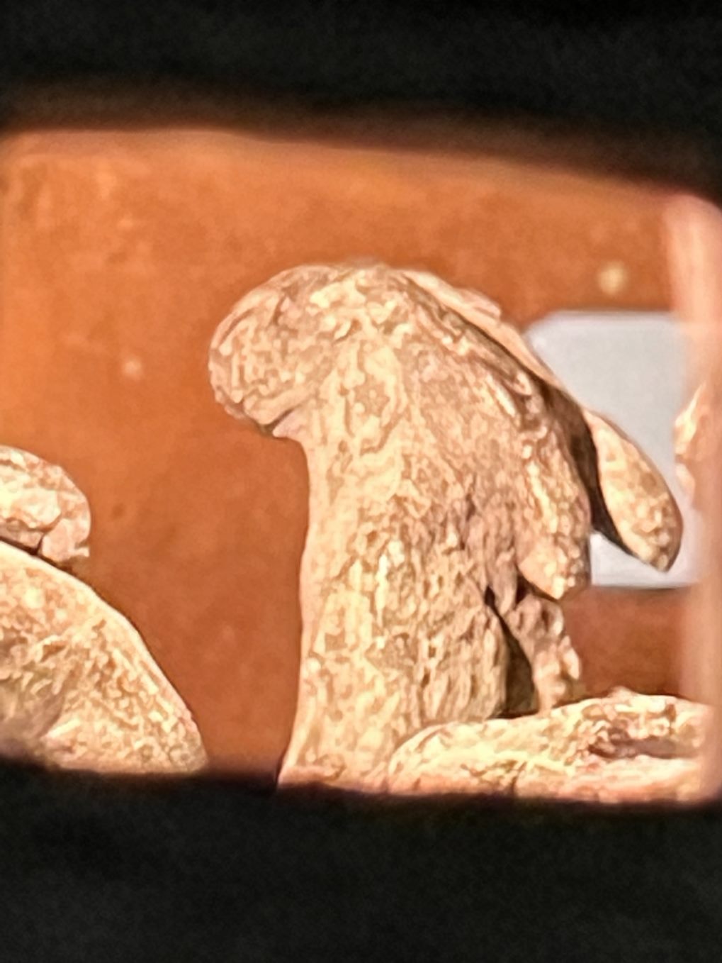
The Ladyhare is a creature born of the artist's imagination. Half-woman, half-hare, she is a recurring character in Ryder's work, appearing either alone or paired with her male counterpart, the Minotaur. Whereas the hare is a creature whose symbolism is deeply rooted in English folklore, the Minotaur has its origins in classical mythology. Picasso's famous representations of this hybrid monster were a direct source of inspiration for the young artist. She speaks of the Ladyhare and Minotaur occupying an ambiguous space between wild nature and orderly human culture.


Other subjects that feature often in Ryder's work - particularly in the large drawings - are her beloved dogs. The last of our galleries is occupied by a large and atmospheric installation. Temple to the 200 Rabbits is a work provoked by the paradox of man's reverence for, and cruel mistreatment of, the animal world.


My favourite piece that I saw created with resin by Ryder was Temple to the 200 Rabbits 1999. This large installation was inspired by two very different experiences. The first took place in the South of France. The positioning of the installations are to represent Ryders inspiration.


Ryder tells how a farmer proudly took her to see the rabbits he was breeding for eating:

"He led me into a dark room with a low ceiling and only one little window with a shaft of sunlight shining through. There in front of me were hundreds of rabbits - some dead, some living, some hopping. The outcome of this experience was that I felt compelled to record it in some way."


In 1995, the artist and her family spent some months in Mexico in a village called Tepoztlan. Rising above the village was a mountain topped by a stone pyramid. This temple, called Teposteko, is dedicated to the Aztec rabbit god of drunkenness and fertility. It was this that provided the title for the work.


The resulting installation - which actually features native hares rather than rabbits - combines her memories of these two contrasting encounters. Subdued lighting and a soundtrack of Morton Feldman's Why Patterns adds an otherworldly atmosphere.


Exhibited alongside the installation is a bronze maquette of the same name. Originally modelled in clay at the Mexican pottery in Cuernavaca, it was cast in bronze on her return to England. The interior of the temple is polished so that the viewer, looking through the windows, has the impression of seeing hundreds of little rabbits.


Research - photography in art - chosen topic for essay

Photography is the art or process of producing images by the action of radiant energy and especially on a light sensitive surface (such as film or an optical sensor). It is an application and practice of creating durable images by recording light, either electronically by means of an image sensor, or chemically by means of a light sensitive material, like photographic film.
It is employed in many fields of science, manufacturing (such as photolithography), business, as well as its more direct uses for art, film and video production, recreational purposes, hobby and mass production.

Photography can be an art form, but not all photographs are created to be artworks or as forms of artistic expression. It took time for photography to be truly recognised as a valid art form. However, in the present day, many art museums and art galleries now exhibit photographic artworks.


Photography art is photographs that have been created to be seen as artworks. They have been developed specially for creative expression, not for a commercial brief. They are rare and collectible and can be exhibited like other forms of artwork.

Photography art differs from other forms of photography that serve educational, documentative or commercial purposes, such as selling products or documenting evidence or process.

Examples of non-artistic photography could include adverts, passport photos, news photography, etc. And personal photography, such as selfies, everyday portraits, and family photos, are also not considered photography art. However, portraiture can still feature in fine art photography. Some galleries even specialise in this type of fine art photography, such as London's National Portrait Gallery.


Photography uses the same essential elements and principles as other visual art forms like painting and sculpture. The most common elements of art seen in photography include:

- line

- shape

- form

- texture

- balance

- asymmetric balance

- colour

- size

- depth

- light

- positive space and negative space


An artist that works well with the talent of photography is Alex Stoddard, he began taking self-portraits at the age of sixteen in the woods behind his Georgian home, and this stirred in him the need to create and express himself through the craft of photography.

His work focuses on the human form and the process of infusing it with natural surroundings. He also strives to create whimsical and surreal portraits.

This photographer mainly focuses on dark, narrative portraiture. What inspires me about his work is that all of his pieces tell a story of their own. What appeals to me most about Stoddard's photos is that they give out genuine emotion; they are dark, depressing, and beautiful, all at the same time, sometimes looking like they are portrayed by a fantasy.


This photo taken by Stoddard in 2017 is called Bleeding out, with a woman in a blue dress is laying in a patch of blue flowers, who is, supposedly, bleeding out as the title states. I like this image because of the consistency of the colour blue throughout, the colour blue can represent rest and can cause the body to produce chemicals that are calming and release feelings of tranquility. It is also cooling in nature and helps with balance and self-expression. Dark blue is associated with depth, expertise and stability, so that this image seems more calmer than the meaning may be. The image has a medium underexposed filter where this gives the overall picture a mysterious and whimsical feeling, like Stoddard had originally intended. The photograph has a rough texture to it, because the patterns of the flowers laying around the woman, as well as the photograph having a soft and silky texture to it as the lighting on the fabric of the dress gives it a smooth shine, the outlines of the shines aren't too bold or bright. The photographer had used a greater field of depth, thus allowing more distance in the image to be more clear with sharper edges, especially in the distance where it looks distant, the smaller the aperture used, the less light would be allowed to be let into the camera lens, making the frame darker. This darker image allows the shutter speed to capture this crisp image with a faster shutter speed as the photographer wanted a still yet meaningful photograph. What I like about this photograph is how simple the image looks, yet how detailed and layered the meanings could be, and so I would say that this image is a success, it captures the whole essence of Stoddards other works that he had created throughout the years.


Monday, 12 December 2022

Research - Conflict and Remembrance

Conflict and remembrance art emerged as an art form produced by artists who responded to consequences of war. Contemporary artists such as Diana Forster and Willie Birch work creatively in this genre to gradually introduce difficult histories to their audiences. Both of these artists have a unique way of expressing history in different art forms, such as street art and sculptures.

Any colour of each conflict and remembrance can mean something different, as colours are used to express emotions, it can be a powerful tool in representing conflict. Using contrasting shades can be a really simple and effective way to show turmoil as opposing colours can show a clashing of feelings and emotions which created symbolism in artworks.

A simple example of this would be to think of poopeint wires being represented by colours as different ends of a spectrum or clashing colours. Using contrasting colours like this would show two opposing sides of reason, creating something for the viewer without the need for explanation.

As well as colour, context also matters, this both creates pieces of work that have many symbolic meanings.


(WWII Marine Corps Aviation is a painting by Historic

Image which was to fineartamerica on August 18th, 2013)


In 1940, at the beginning of the Second World War, Stalin's troops invaded eastern Poland. A million Polish people were forced from their homes at gunpoint and sent to labour camps in Siberia. Diana Forster's mother and grandparents were among them.


“Diana's practice in art and conflict arose from her mother's experiences in Poland in the Second World War. Her mother was forcibly removed from her home in eastern Poland when Stalin's troops invaded, and was transported along with an estimated 1.7 million other Polish people to labour camps in Arkhangelsk and Siberia. Diana tries to communicate the unimaginably shocking rupture between a settled, normal life, and a terrifying future decided by people who don't care about you.” - Web.


Forster avoids showing traumatic, disturbing images in her installations and prints as they can turn viewers away. Accepting the art in presenting subsequent generations with the realities of war, we have to find new ways of engaging audiences and Diana does this through formal qualities which draw the viewers attention while the work is gradually understood. She creates impactful, meaningful abstract scenes with simplified images of cutouts of what happened in the war, shining light onto them to cast shadows on the wall can represent people, being the light, recognising what had happened and coming to terms that it actually happened.


Whereas Birch is best known for taking up social justice issues with a style that alludes while also drawing on folk art. Initially known for making use of rich colors, Birch now works predominantly in black and white, a shift that coincided with his move from New York back to his home city of New Orleans in 1994. His works earned the attention of critics early on, with the New York Times’ Roberta Smith in 192, 9n the occasion of a show that storied Exit Art gallery, that Birch “casts an unflinching yet loving eye on black life in America.”
Some of his figurative works range from materials such as pencil and gouache on paper depicting a lone youngster playing against a desolate backdrop or decrepit or abandoned buildings alongside a griffiti-streaked vacant lot, to Ritual of Inevitable Violence (1989), a seemingly charming scene of five boys playing in a grass-strewn lot that takes on a sinister tone as the viewer realises the boys are sucking on the barrels of gun-shaped candies, which can indicate more sinister meanings, and they’re more modern comparing to war related art. But this also relates to the violence that is influenced onto people depending on where they’re from and what their background has been.

Monday, 5 December 2022

Research - Portraits

A portrait can be either a photograph, painting or sculpture, or other artistic representation of a person. In which the face and its expressions are predominant. The intent is to display the likeness, personality, mood and even the patriarchal status. But in photography, it is not considered a snapshot, but a composed image of a person in a still position. A portrait often shows a person looking directly at the painter or photographer, in order to most successfully engage the subject with the viewer.

Most early historic representations are clearly intended to show an individual era of rulers, and tend to follow idealising artistic conventions, rather than the individual features of the subjects body, though when there us no other evidence as to the rulers appearance the degree of idealisation can be hard to assess.

The art form of portraiture goes back to at least ancient Egypt, where it flourished from about 5,000 years ago. The uses of paint, sculptures or drawn portraits were the only way to record the appearance of someone before the invention of photography. A portrait is intended to record the appearance of an individual, but may sometimes represent a type. They may be of any medium used for sculpture, such as marble, bronze, terracotta, plaster, wax or wood.

They have been used to show the power, importance, virtue, beauty, wealth, taste, learning or other qualities of the sitter. Portraits have almost always been flattering, and painters who refused to flatter, such as William Hogarth, tended to find their work rejected.


Figurative art describes any form of modern art that retains strong references to the real world and particularly to the human figure. It is a type of art where the subject matter is recognisable from the real world, hence it shares a “likeness” of shapes, objects, figures, or even places. For example, the Mona Lisa.

Hans Holbein the Younger, self-portrait.jpg

An artist who was well known for his portraits of wealthy and known people is Hans Holbein the Younger (1497 - 1543), who was a paint and print maker who worked in a Northern Renaissance style, and is considered one of the greater portraitists of the 16th century. He is called "the Younger" to distinguish him from his father, Hans Holbein the Elder, who was an accomplished painter of the Late Gothic school.

His art has sometimes been called realist, since he drew and painted with a rare precision. He was never content with outward appearance, however; he embedded layers of symbolism, allusion, and paradox in his art, to the lasting fascination of scholars.

Such as his work called 'The Ambassadors,' created with oil on oak in 1533, with Jean de Dinteville and Georges de Selve, containing all sorts of symbolism with the objects in the image.


My opinion on this painting is that it could show some of the luxuries of that time period, such as the globes and lute can show that people with money could buy such things, whereas today anyone can buy them. The curtain that covers the background looks expensive, apart from the material, green had a resurgence in art during the Impressionist movement due to advancements in green pigments and paints, as it could be seen as a rich colour depending on the setting.

The Ambassadors was painted during Holbein's second stay in England (1532-43), which coincided with Henry VIII's break with Rome - over his decision to anull his marriage with Catherine of Aragon - and the formation of the English Protestant Church.

The painting memorialises Jean de Dinteville, French ambassador to England, and his friend, Georges de Selve, who acted on several occasions as French ambassador to the Republic of Venice, to the Pope in Rome, and to England, Germany, and Spain. Upon closer inspection, it is seen that the face of Dinteville is in more light than Selve, potentially suggesting that Holbein highlights more important figures this way. Dinteville is positioned with his legs more apart suggesting that he is asserting dominance in a way, showing who is more powerful between the two. Them both being stood on a patterned floor in front of a green, what seems expensive, curtain, also showing that they are high in status as they would be able to afford these types of things.

The upper shelf includes a celestial globe, a portable sundial, and other various instruments that are used for understanding more about the heavens and measuring time, while the lower shelf reflects the affairs of the world as it contains musical instruments, a hymn book, a book of arithmetics and a terrestrial globe. This could all show a representation of space and things about stars on the top shelve, suggesting that it is the sky, and earth as things we would use and find on earth are there too. Potentially showing the important things.

Furthermore, the religion and politics was reflected symbolically in the details of the painting.

- A crucifix that is half-obscured by the green curtain in the top left of the painting, symbolising the division of the church.
- The broken string on the lute evokes ecclesiastical disharmony during the Reformation.
The Reformation was the start of Protestantism and the split of the Western Church into Protestantism and what is now known as the Roman Catholic Church.
- The open book of music next to the lute has been identified as a Lutheran hymnal, and the book of mathematics is open on a page of divisions which opens with the word "Dividirt."

At the bottom of the image we see an elongated skull, as artists often incorporated skulls as a reminder of mortality. Holbein may have intended the skulls and the crucifix in the upper left corner to encourage contemplation of one's impending death and the resurrection.


Another painting of Holbein's called 'A Lady with a Squirrel and a Starling (Anne Lovell?).'
It is an oil-on-oak portrait completed in around 1526–1528 by German Renaissance painter Hans Holbein the Younger. The painting shows a demurely dressed young woman sitting against a plain blue background and holding in her lap a squirrel on a chain eating a nut; a starling sits on a grape vine.

My opinion of this painting is that the Starling could be telling the Lady something, as Starlings are symbolic of communication, of relationships with your other people of society, and your standing in society. They also symbolize unity; often seen flocking together, these birds have learned that we are always stronger together than alone.
The quote of 'your standing of society' can refer to the woman's status in the time that this was painted (1526 - 1528), as the woman's job was to take care of the home, help her husband with his work, and produce children. Power writes, “the great majority of women lived and died wholly unrecorded as they laboured in the field, the farm, and the home” (Loyn, 346).
A squirrel, like the ones in the Lady's lap, represents rebirth, renewal, energy, positivity, hard work, duty and balance. While squirrels consistently guide us towards working hard and being prepared, the squirrel totem specifically guides one's attitude. The squirrel totem represents positivity.
Both of these animals together could represent the Lady's future, to remind the Lady of staying in her place due to the patriarchy.
The background of the painting is a darker turquoise colour, and the representation of this colour means wisdom, tranquility, and protection from harm and negative energy. Meaning that the Lady is in a state of piece with her current lifestyle.

Women who faced left in portraits were suggested to be a weak and submissive role in society, whereas facing the right in the painting makes them seem more powerful. Which was common for painting with people in higher power, as they had the wealth and status.

Module pieces - Frutiger Metro

(an example of Frutiger Metro) Frutiger Metro is a broad design aesthetic that encompasses the "Frutiger" vector-based graphic des...